Get More Out Of Your Creative With These Tested Tips

If you are responsible for applying any kind of creative, photography, art, or imagery to drive a desirable action – you should read this post to the end. Using creative similar to those that have performed well in the past is a great place to start when charged with a creative campaign. With 30,000 ads tested over six months – this study from Rocket Fuel might be the most comprehensive look at what drives users to click, convert, and engage. But remember, understanding the statistics of the game is like understanding the odds in a poker game: having a good idea of how to play won’t guarantee results, but it will increase your chances of winning.
Background
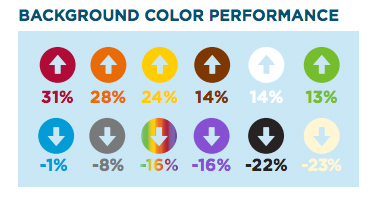
There are some attributes that are universal across verticals and can be used as the building blocks or reference points when starting from zero. Consider the first few seconds an image loads and what impact the background color can have on a user. It’s surprising to find out that red backgrounds prove to have 31% higher engagement when compared to images with other background colors. Black, off-white, and purple were among the worst performing colors. If your ads are primarily set in reverse - which means white copy on black – try starting with a white background. If you have a formula, tweaking one aspect (with the statistics to back it up) might be just the thing you need to boost engagement.

Content
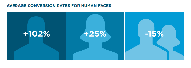
Across each vertical there is something else that makes a big difference: human faces. It’s interesting to note that this study found that a male in an ad drives 102% more engagement, while both a man and a woman is 15% less likely to drive the same results. Understanding the psychology behind these numbers might drive the point home. With only one figure in the ad, either male or female, the audience is inclined to imagine themselves in the ad. By doing this, they are filling in the gap in the picture with themselves.

Logo Placement
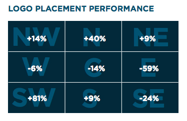
Once the message is clear, the art and copy perfect, it’s time to place the logo. According to Rocket Fuel, the logo performs a whopping 81% better in the bottom left corner of an ad. The logo performs the absolute worst when placed anywhere on the right side. Perhaps this is because it interferes with the way a user scans an ad from left-to-right. By placing the logo on the lower left; the entire message is more easily digested.

Call To Action
Changing the call-to-action is by far the easiest way to test an ad and measure results. By changing out the simple one-to-three word call-to-action on an ad, the results can improve ten-fold. A call-to-action on an ad that indicates more effort needed from the user proves to be the least effective and these include: “Try It Now”, “Apply Now”, and “Read This”. The prompt that seems to indicate that the user will receive something in return did the best: “Learn More”, “Build Your Own”, and “Get It”.

Bringing It Home To B2B
In the business-to-business vertical there are specific differences to how ads perform that are worthy of taking a closer look. It’s interesting to note some differences and similarities when compared to the overall picture of all verticals. For example, the logo on an ad does the best in the top right corner of an ad and creative with humans present did better than without. Ads with taglines proved to be 17% more effective than those without. This might mean that using the company's tagline can help to establish product features and positioning with users. Engagement with an ad went way down when an ad used “conquest messaging” – or messaging that leverages one brand better than another. Instead of a desired effect of better engagement, the conquest messaging served to merely inform potential customers of rival products.
Now that you have the most important points from this extensive study, it should serve as a backbone to create and test creative. Whether you are in the business-to-business market or are interested in industry best practices, these statistics are great for making objective decisions. Finally (we didn’t need to find this in the study), but adding in a puppy or cute kitten is always a good idea. Whether or not it attracts the audience you are after is another story.
