Iconic Soft Drink Gets A New Brand Logo and Packaging
The original lemon-lime soda, 7up, was introduced to consumers in 1929. Originally named “Bib-Label Lithiated Lemon-Lime Soda,” it once contained a mood-stabilizing drug that was marketed to cure hangovers. Since then, the formula for 7up has changed, and the brand is now controlled by two companies (Dr. Pepper Snapple Group for the US, PepsiCo internationally), with conflicting brand identities between the international version of 7up and the American version. In the US, 7up’s latest logo and packaging takes cues from its former branding and ties them in with a contemporary approach to position the drink as a fun, yet unique drink for the creator in you.
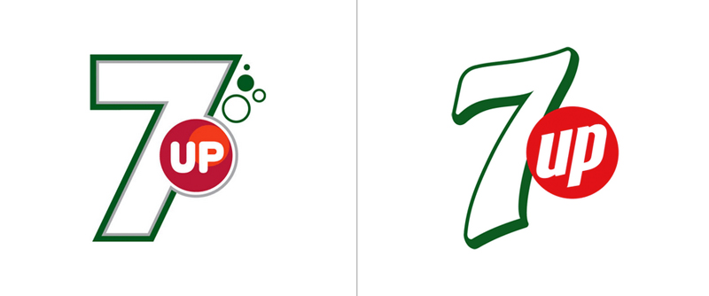
Brand consultancy firm, Sterling Brands, created a logo that complimented the drink’s “fizziness” by incorporating bubbles with cleanly executed, retro-inspired type that is reminiscent of 7up’s past designs. In contrast, the international version of 7up’s logo is completely contemporary, with sharp lines and very little resemblance to the brand’s former image other than the big “7” and little “up” in a circle.
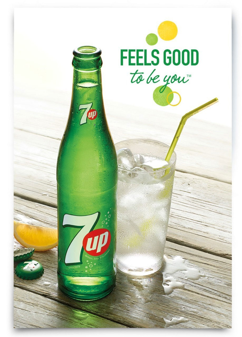
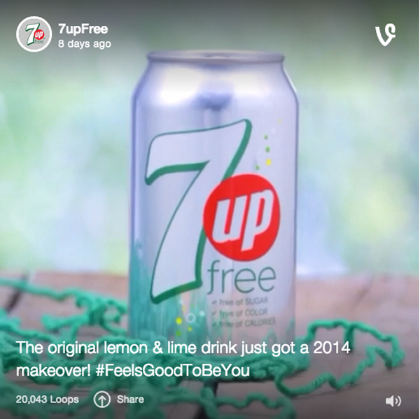
In addition, print and social media campaigns regarding the US version of the soda have no celebrity endorsement, but a strong focus on the product and the artistic crowds.
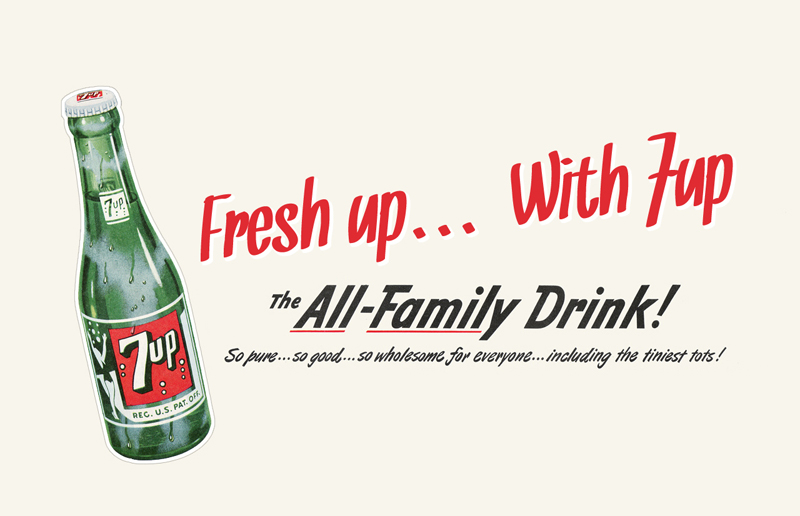
What was once known as a “family drink”, 7up has undergone many different themes in its 70-plus years of existence. Since two different companies control 7up, it may never have a consistent global brand image. However, this logo refresh brings the soft drink up to date with its competitors and positions itself towards an emerging market in the US. Hopefully this rebranding calls for an end to the identity crisis for the former “un-cola” and reinforces itself as a drink as unique as the person drinking it.
Information and images courtesy of (c) UnderConsideration and Design Week
