The Beauty of Retro Branding

It’s common to see consumer product packages that utilize design techniques and trends that take visual cues from decades to centuries ago. While some companies tend to be hip and up-to-date with current design trends, as consumers, we can’t help but appreciate a piece of nostalgia that we once knew. Vintage or retro branding not only pays homage to the legacy of a brand, but also the ability to empathize with the culture of the past.

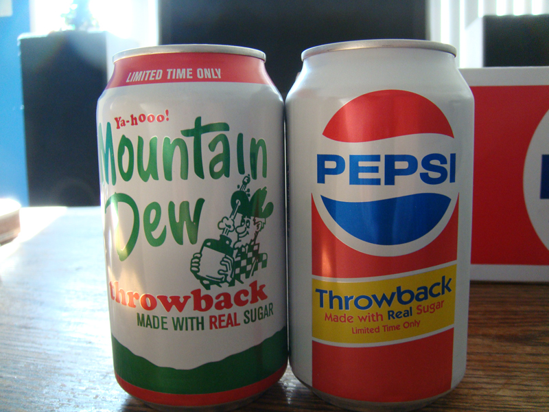
PepsiCo’s “Throwback” lines of soft drinks are widely available examples of vintage rebranding. These drinks differ from their updated counterparts by using real sugar instead of high fructose corn syrup, as they once did before the price of sugar rose in the 1980’s. The use of the brands’ original logos on cans and packaging complements these original recipes.

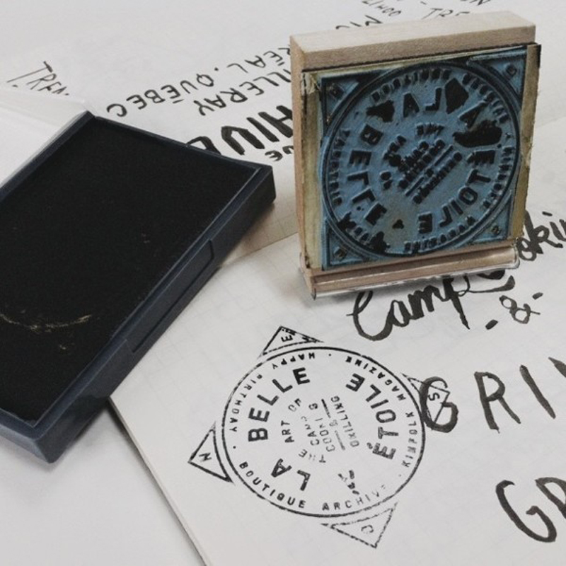
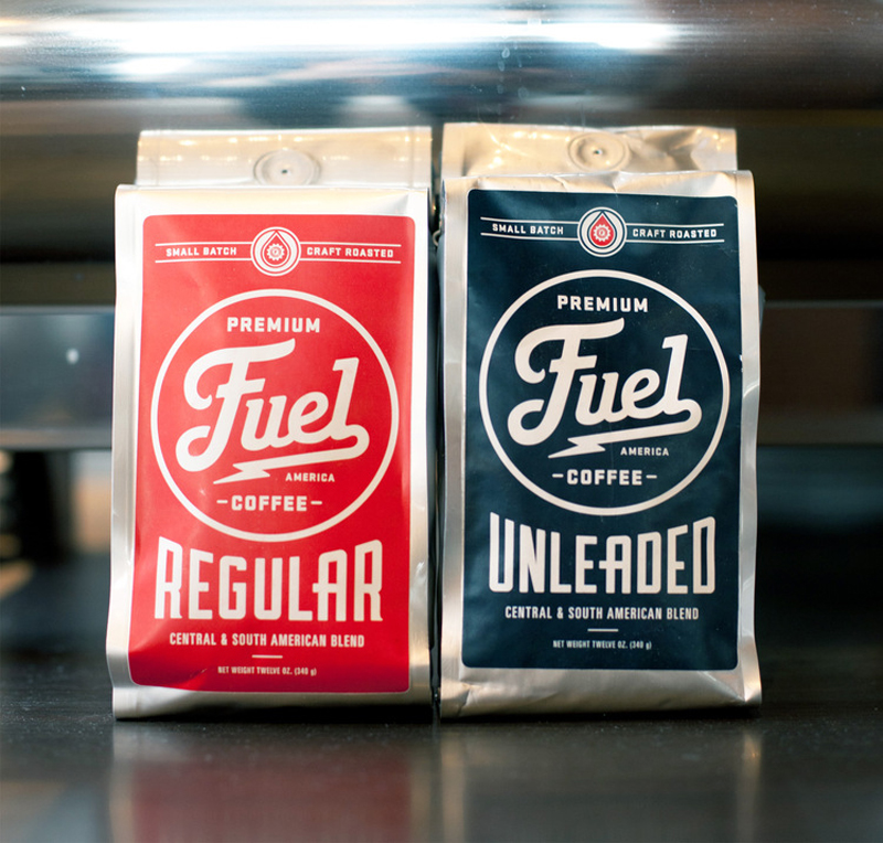
Brand identities for companies are also no stranger to the retro-modern style. It adds authenticity, warmth and a sense of quality to a brand’s image. This helps consumers develop a trustworthy brand image. Some products and services utilize vintage lettering to achieve the perception of high quality and/or ruggedness.

The appreciation and reception of retro design has proven that it is a trend that will continue to be used. The key takeaway from these brands is a product of quality, one that has or will endure the test of time.
Images courtesy of (C) Behance and Design You Trust
