How Bad User Interface Designs Can Negatively Impact Customer Experience

When it comes to web design, it’s always in a brand or company’s best interest to design the best user interface possible. However, we as users sometimes come across bad design practices during purchases, newsletter subscriptions and even within social networking. What’s worse is that these inconveniences aren’t mistakes; they’re implemented to try and trick users into actions that they aren’t aware of. Dark Patterns contains examples and a nomenclature of these bad design practices that websites have been found guilty of. We take a look into some of the most common dark patterns that consumers come across on the web.
“Friend spam” is normally encountered from websites or applications wishing to use credentials from a social network or email address in order to post content or take other actions through your account. LinkedIn, the popular professional social network, has an ongoing problem with its connection management tab for newer users. Before you can try to manage connections on your own, it insists that you add connections from your linked email account, as well as invite others who do not have a LinkedIn account from your email messages. Although you can skip those steps, each time you try to manage connections, you will be prompted to the same screen.

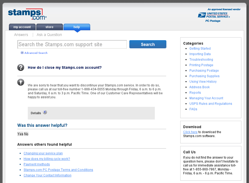
When a user signs up for a free trial of an online service, they are required to enter credit card information that will automatically subscribe them after the trial end date. This is known as “forced continuity.” Users are not given adequate reminders, and they are automatically billed. In 2013, Dark Patterns featured how the website stamps.com made customers go through “an arduous journey” in order to cancel their subscriptions. Instead of a simple one-click cancellation button, users had to request to cancel through a comment form, then contact their help center. Again, stamps.com still has yet to make their cancellation a one-click process, as customers must call their help center in order to do so.

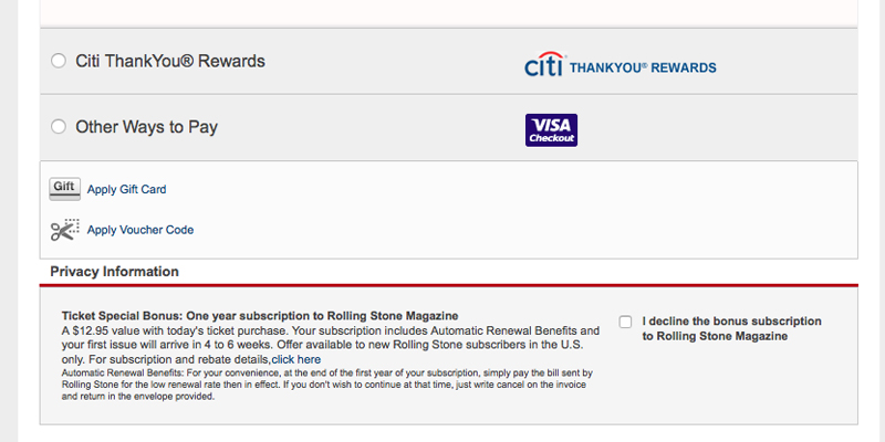
The most common dark pattern in e-commerce websites would be the “sneak-into-basket.” This happens when we attempt to purchase a specific product, yet somewhere in the checkout process, an additional product is included. Livenation.com tried to sneak magazine subscriptions during checkouts, but to make matters worse, the checkbox they needed to click on was on a page that was easily missed, in the “Privacy Information” section of their website. Much like the previous two examples, they have not changed this part of the checkout process.
These dark patterns end up leaving consumers betrayed and often dissatisfied. They will also leave a negative impact on a brand, prompting consumers not to recommend it amongst their peers. As responsible marketers, designers and developers, we should be adamant not to implement these “tricks” into our own website design.
Information and images courtesy of Dark Patterns.
