Logo Redesigns: The Good, The Bad, And The Ugly

As target markets get more technologically savvy and younger, brands take into account the need to rebrand or redesign in order to appeal to them. One of the most prominent changes that consumers may quickly notice is a logo redesign, which is subjected to criticism, thanks to the power of the Internet. Today, we look at some of the most recent logo redesigns and the sentiments that consumers have towards them.
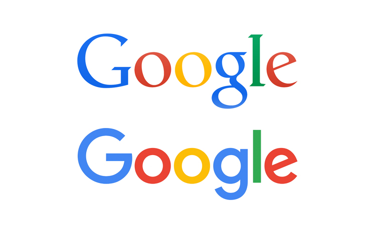
It is no secret that people seem to love Google’s new logo. Designers and creative directors rave that it isn’t about just a simple logo redesign; with an interactive interface that morphs the type logo into a series of dots, it is an identity of Google’s “smart system.” The new logo remains coherent to the existing Google brand image, which remains simple and fun, despite their reputation as a leading edge tech company. Connie Birdsall of Lippincott says,
“It speaks to the future potential as well as the current functionalities of the Google brand. The four dots are really beautifully choreographed to communicate with us ‘human beings’—it is actually pretty magical and 100% universal. The design and precise craftsmanship show a great depth of intelligence and restraint not typical of these types of evolutionary programs.”

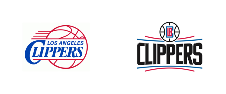
The Los Angeles Clippers’ new logo has not been as well received. Now under new ownership, the former Microsoft CEO, Steve Ballmer decided that the former logo was outdated and in need of a redesign. By trying to utilize a retro approach, the new logo is supposedly inspired by the brand’s nautical roots, with the curved lines symbolizing the horizon of the ocean. However, this is not really evident as there are no other nautical themes present. Under Consideration notes that, “The typeface is generic, and the CLA monogram looks congested and random at best.” In addition, many Clippers fans are most unimpressed, signaling a failure of the logo redesign.

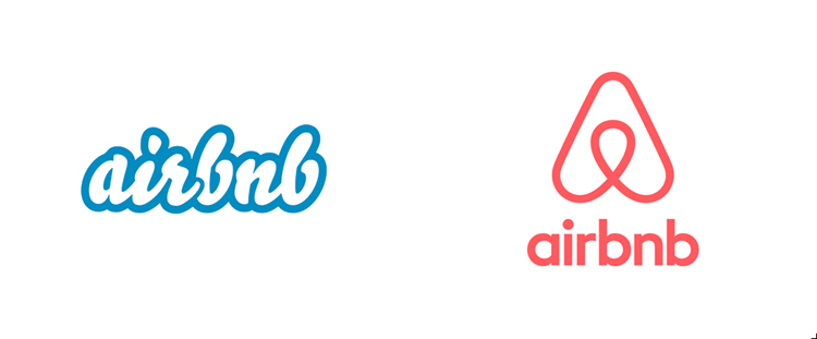
For better or for worse, AirBnB’s logo, a “Belo” has become subjected to criticism over its resemblance to the female human anatomy. Despite the backlash the redesign received, the company has stood by it. As Kevin Grady of FastCoDesign states,
“A strong sense of community is central to Airbnb’s stated core values, and Bélo—with its customizability and warmth—is a perfect fit, regardless of what the Internet critics initially thought of it. Airbnb didn’t need to back down because ultimately it was very much in sync with its audience. To revert to the old logo was unnecessary and was likely never seriously entertained.”
When it comes to redesigning a logo, the most important thing to take into account is how people will interpret them. A good logo can enhance the brand experience, whereas a bad one will take away from it and potentially lead to some kind of dissonance against the brand. Nonetheless, when a company redesigns their logo, they are also redefining their image to keep up with the constantly evolving markets.
Images and information courtesy of FastCoDesign and Under Consideration
