
IHOB And Other Rebranding Blunders Over The Years
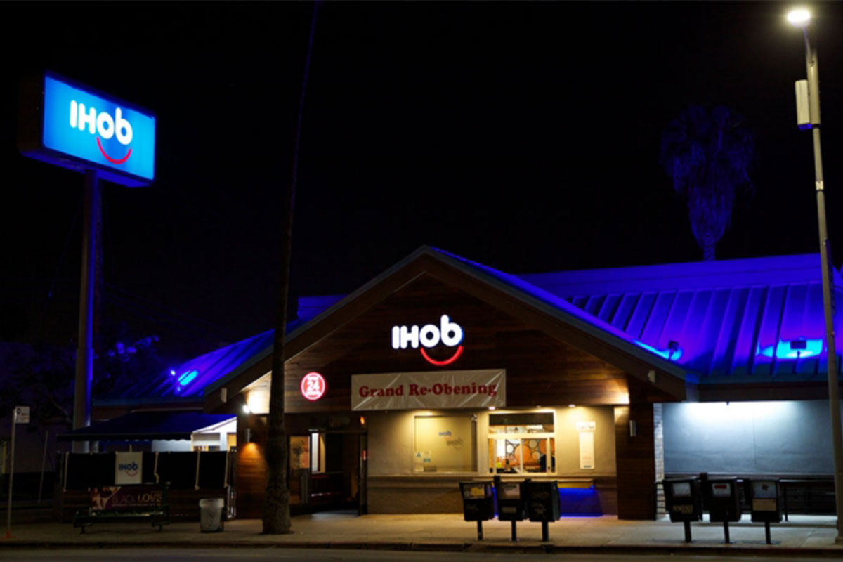
Do you order pancakes or burgers from IHOB? In case you don’t know what’s going on in the world of rebranding, IHOP, also known as the place you hit up to wash down stacks on stacks of flapjacks, in an elaborate marketing ploy, recently announced that it was officially changing its name from IHOP to IHOB. In the beginning, people assumed that the B meant breakfast, which was understandable.
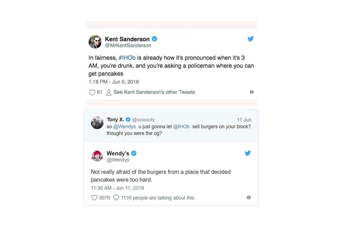
However, nobody was prepared for when it was revealed that the B actually stood for ‘burgers.’ And, like clockwork, the internet exploded, offering its two cents to the change. As expected, social media users did not hold back.
This isn’t the first time a brand tried to get a fresh new image, and unfortunately fell on its face in the process. In fact, here are a few examples of rebranding disasters.
BP
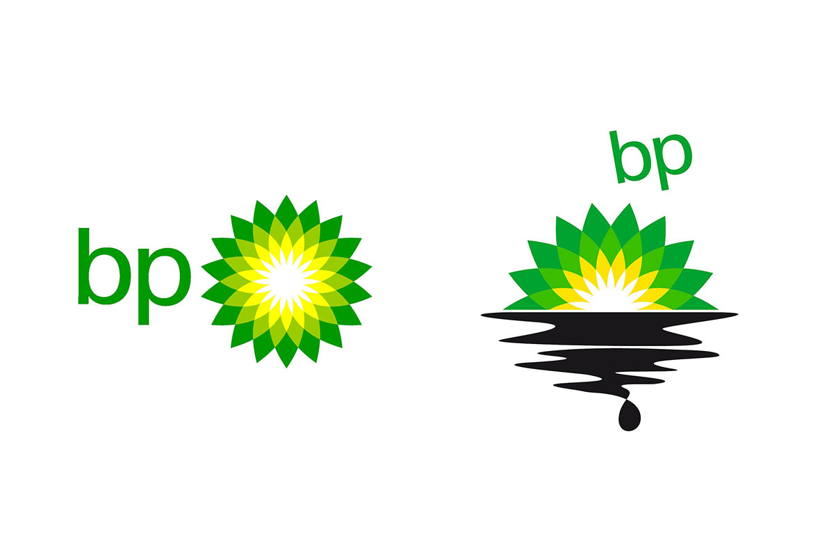
In 2000, in an attempt to convey an image of environmental conscientiousness, BP redesigned its logo. The “Helios” logo replaced the one they had used for over over 70 years, and the redesign cost the company approximately $211,000,000. Needless to say, immediately following the great marine oil spill of 2010 caused by BP, the Helios logo became well-known for all the wrong reasons. Greenpeace even challenged people to redesign the logo once again, only this time in relation to the spill.
Gap
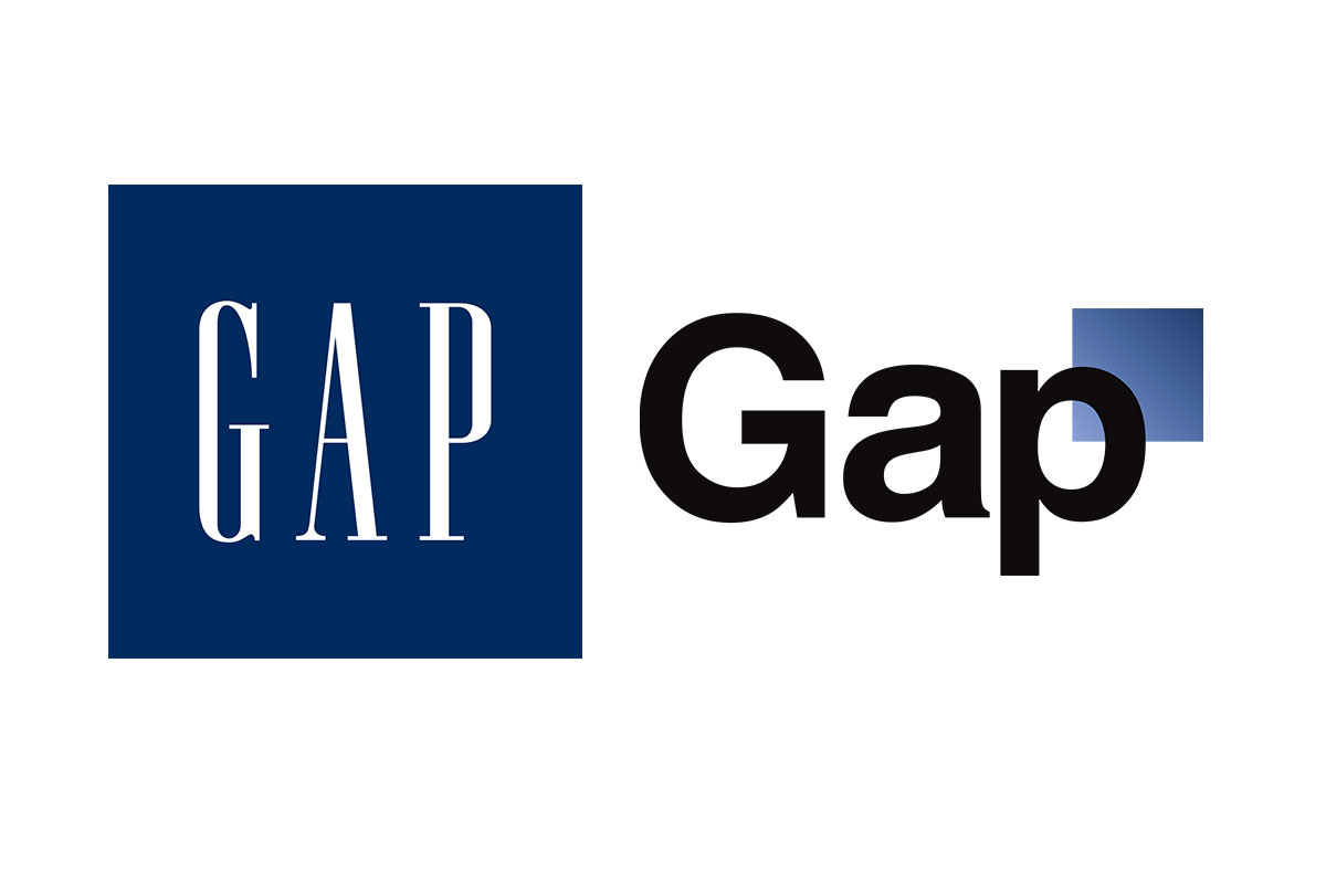
In 2010, Gap revealed its new logo and the reception to the reveal was less than warm. The change was enough to enrage dozens of loyal consumers.
One facebook user took to the web, sharing their thoughts in one particularly scathing post: "This is the worst idea Gap has ever had. I will be sad to see this change take place. If this logo is brought into the clothing [store] I will no long[er] be shopping with the Gap. Really a bummer because 90% of my clothing has been purchased there in the last 15+ years."
The backlash was so strong that the brand worked to restore its old logo.
Radio Shack
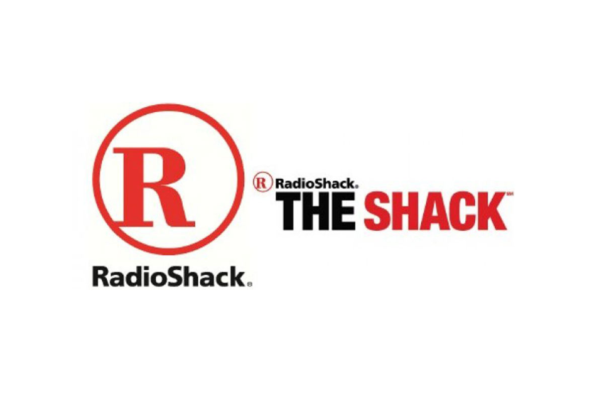
RadioShack made a decision to rebrand to “The Shack.” Millions of dollars were spent advertising the rebrand in an attempt of attracting a younger and trendier audience. Unfortunately, the move made RadioShack look like an old, washed-up company trying to come back as hip and cool. The idea of a rebrand in itself wasn’t terrible; it was the execution that failed Radio Shack.